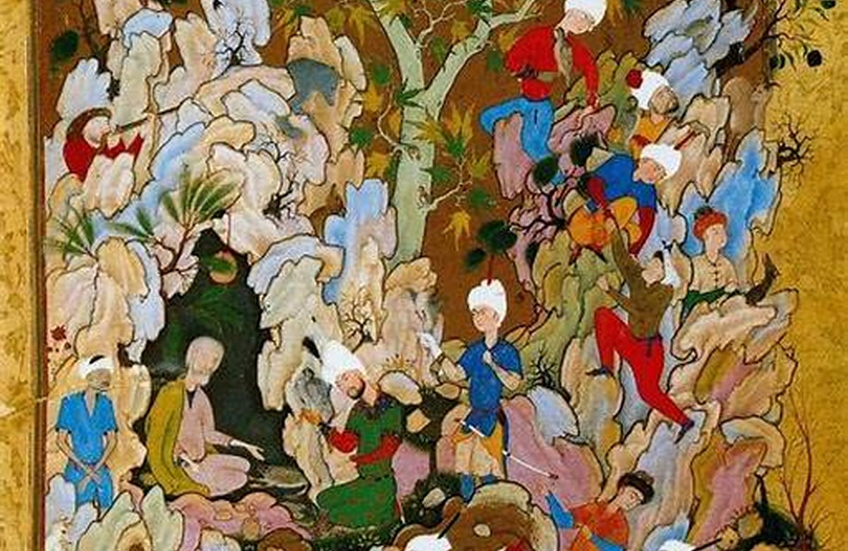
Materials and motifs are not background details in Persian art; they are part of the meaning and structure of the object. Blue and turquoise became powerful visual anchors in Persian tilework, enamel and interiors because they work with light as much as pigment.
Why it stands out
Turquoise from northeastern Iran, especially the Neyshabur area, has a long reputation in jewellery and decorative art. Natural stone varies in colour, matrix and surface character. The colour turquoise also became important beyond the stone itself, especially in tilework and enamel.
That distinction matters because decorative complexity can hide poor finishing just as easily as it can reveal skill. Meaning is rarely fixed forever, so visual context is more reliable than assigning one universal symbolic translation.
Material and visual behaviour
Persian tilework can be read as architecture and graphic design at once. Repeating units create large surfaces while calligraphy and vegetal ornament establish hierarchy. Different periods and buildings use different techniques, including mosaic tile and painted multi-colour tiles; it is better to identify a method carefully than to treat all tile surfaces as the same craft.
The strongest examples usually feel controlled rather than mechanically perfect: the eye can sense rhythm without losing the presence of the hand. Meaning is rarely fixed forever, so visual context is more reliable than assigning one universal symbolic translation.
How the motif travels
Blue works especially well on architecture because daylight changes it continually. Turquoise, cobalt and deeper blues can separate surfaces, emphasise domes and create contrast with brick or plaster. In small objects such as minakari, blue carries an architectural association without needing to reproduce a building literally.
It is also worth separating historical association from modern marketing. A living craft can be valuable without pretending every contemporary object is an unchanged survival from antiquity. Meaning is rarely fixed forever, so visual context is more reliable than assigning one universal symbolic translation.
How to use this knowledge
Intricate craft usually looks strongest when surrounded by quieter materials. Negative space lets pattern register instead of competing with other ornament. Scale matters: a small detailed object belongs where people can approach it, while a textile or larger vessel can carry visual weight from across a room.
For a contemporary buyer, this creates a useful balance between visual pleasure and informed judgement. Meaning is rarely fixed forever, so visual context is more reliable than assigning one universal symbolic translation.
- Turquoise from northeastern Iran, especially the Neyshabur area, has a long reputation in jewellery and decorative art. Natural stone varies in colour, matrix and surface character.
- The colour turquoise also became important beyond the stone itself, especially in tilework and enamel.
- Persian tilework can be read as architecture and graphic design at once. Repeating units create large surfaces while calligraphy and vegetal ornament establish hierarchy.
Sources & further reading
- Victoria and Albert Museum — Islamic Middle East collections
- The Metropolitan Museum of Art — Heilbrunn Timeline
- British Museum — Collection
This Journal is written as accessible editorial guidance, not as an attribution or authentication service. Dates, workshop practices and regional labels can vary by object.